

October 15th, 2019 / by HomeSquare’s in-house designer, Katie Canfield
“First Light” has just been named Color of the Year by Benjamin Moore. The rosy soft hue might seem a bit intimidating to use anywhere in your home outside of a nursery (especially if you’re trying to get approval from any men in your house), but this soft tone, dubbed “millennial pink” in fashion and other industries has been trending for a while now. See some tips below on how to incorporate this color into your home and decor!
Pink as a neutral
Ok, call me crazy, but I think blush can be a great color to use as a neutral to set the tone for a palette. It’s subdued, and can let other tones really shine and sing. Just like black, gray, navy and beige, if used properly blush can be cozy and elegant. It’s particularly popular in many bohemian and eclectic styled homes. In my own apartment I’ve styled a soft blue-grey sofa with metallic rosy throw pillows, and a blush knit blanket. Some of the more eclectic, bold pieces take the stage, like a ridiculously floral antique wing chair, a hot pink rug, and brass coffee table.
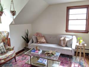
Author’s Living Room
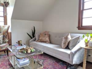
Author’s Living Room
Blush pairs beautifully with, and complements so many different hues. It really can be quite the chameleon in any style. Jewel tones like teal, emerald, mustard, and navy look stunning and bold with blush. Alternatively, go for an overall softer pattern with brass or gold, gray, camel and white. Paired with warm woods like walnut, oak and maple blush can feel cozy and uniquely modern.
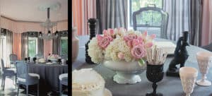
Mary McDonald
This dining room by Mary McDonald uses soft pink window treatments, and she carries the hue subtly through to the ceiling, which makes the white medallion really pop.
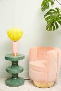
India Mahdavi
India Mahdavi has an uncanny ability to use pink in fantastic ways. Her Charlotte chair in soft pink acts as a neutral with green and yellow.
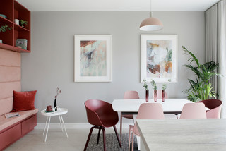
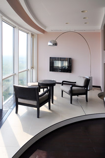
Here are some other examples of using pink in living areas.
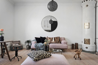
Photo by Strindberg Mäkleri AB
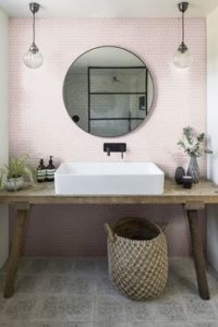
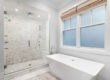
Pink in the bathrooms
What goes around comes right back around again. I know that some folks older than me, would absolutely detest the suggestion of using pink in a bathroom. After all, some people are still trying to demolish and update their 50’s pink ceramic bathrooms, but here are some creative ways to use the color of the year in your bathroom.
Subtle splashes of pink in an overall neutral bathroom can either read as playful and contemporary, or slightly feminine. Pairing with brass fixtures, bright whites, and even black marbles can be fun and elegant.
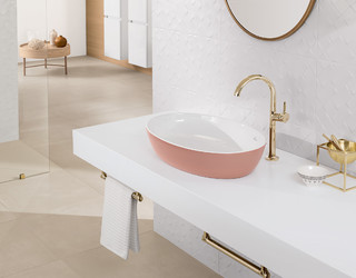
Using contemporary tiles in pink with brass can be fun and modern in a hall bath, or a kids’ bath without feeling overwhelmingly feminine.
Via Pinterest
Pairing pink and matte black can be a great way to break from the overwhelming sea of farmhouse style bathrooms.
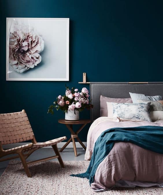
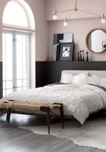
Blush in the bedroom
This warm rosy hue can be serene and calming, without feeling overly fussy and feminine. If blue can be gender neutral in a bedroom, then I think that blush can be too. Here are some great examples of using blush in an adult bedroom. Consider it for a guest room if you aren’t ready to use it in your master bedroom.
for photo credits
Pink Products
If you’re not ready to make a full commitment to blush yet, here are some of my favorite products that you can use to accent your space – but always remember that paint colors aren’t a lifelong commitment.
You can incorporate the color by adding accent pieces like this mirror by Bower Studios. Perhaps the simplest way to incorporate a hint of blush into your decor is to add some pillows, or throws to your living area like these from Westelm this, this or this
Another option would be to use this fabric by Mary MacDonald for Schumacher, or these Claesson Koivisto tiles by Marrakech Design.
These textiles by Rogers and Goffigon, here and here also provide a hint of pink option. Consider an accent table such as this one from Maggie Cruz or this gorgeous credenza
For lighting options check out the Leighton in blush glass by Kate Spade for Circa Lighting, or the Bradford in blush and polished nickel also by Kate Spade
Katie Canfield is the founder and principal designer at Studio KC. Studio KC got its humble start in 2015 when Katie was just 23 years old. While she was freelancing with other interior designers in the NY and CT area she also became a go-to designer for local contractors and trades that needed a designer’s help for their clients whether it be for custom cabinetry drawings or plans for a gut renovation on an entire home.
Katie Canfield’s design aesthetic is eclectic and flexible. She delights in the marriage between old and new- keeping spaces approachable but still matching each client’s unique aesthetic and family narrative. Her passion for design keeps her motivated and constantly on the hunt for new trends and materials. Her broad experience includes an art history background, study at the Accademia Italiana in Florence, a stint with the renowned Manhattan firm Amanda Nisbet Design, as well as collaborations with builders and designers across the tri-state area. She’s seen it all: from gutting prewar Manhattan apartments to new construction in the ‘burbs.


1 Comment