 We are wrapping up and winding down in 2020, and Benjamin Moore has just announced their Color of the Year for 2021, Aegean Teal! While most of us don’t tend to change the colors in our homes every year, these color choices can forecast trends in design for not just paint colors, but home furnishings, décor, accessories and even fashion.
2021’s Aegean Teal provides a much needed sense of calm after a stressful year. And it’s quite possible we’re looking for a more calming palette to sooth our anxieties as we all have spent a lot more time in our homes doing a lot more activities like work and exercise. There are many ways to incorporate Benjamin Moore’s Color of the Year into your home without painting the walls. Here are some fun ideas for both the bold and the color shy!
Wrap Your Walls in Color
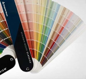
There are tons of ways to add colors to our walls. The most common go-to? Paint of course. I highly recommend purchasing quality paint which provides a thicker, tougher paint film that’s more durable. Considering the type of finish that’s appropriate for your space is important. As a professional, I always start off with my Benjamin Moore paint decks.
Although having quality paint is important, the difference between a DIY job, and a true high-quality professional paint job is remarkable and important. A professional painter will take the time to prep your walls, fill and patch holes, sand, and make sure you have a good surface to work with.
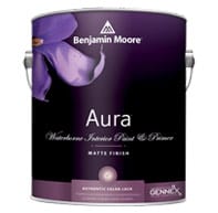 I love Benjamin Moore’s Aura paint, it gives great coverage and durability, the matte finish gives a nice even texture and depth of color, it can hold up to higher traffic areas where you may have previously used eggshell, but gives a softer sheen. Of course you can go bold and do a high gloss lacquered wall. Just remember: the more shine there is in a paint finish, the more attention will be drawn to imperfections as the light will glare on uneven surfaces. This is another big reminder to hire a professional!
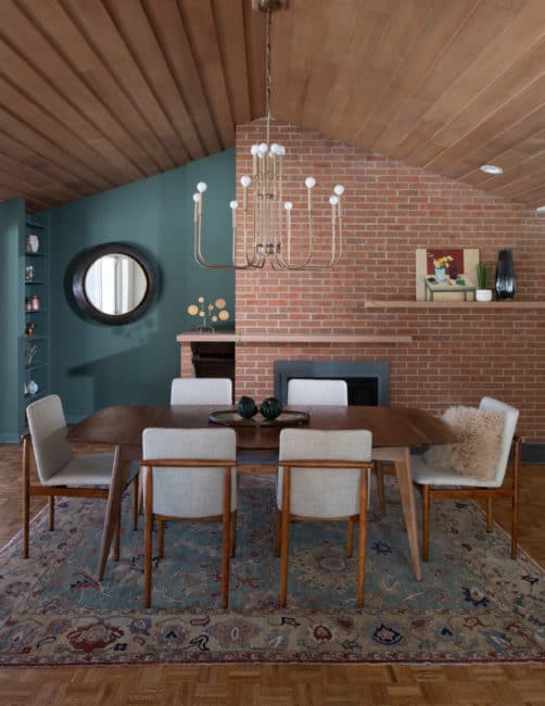
This teal painted wall complements the brick tones and wooden plank ceiling. Using an area rug with both the blue and earth tones really helps tie it all together!
Paint is a quick way to change the color of a space, and relatively low commitment. But if you’re looking for more impact, think about changing up materials like using wallcovering or painted paneling.
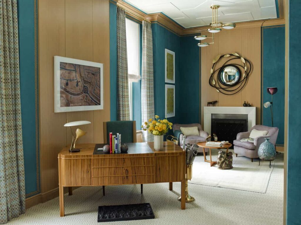
This “Lady Lair” designed by the Mendelson Group for the Kips Bay Showhouse in NYC back in 2014 has sumptuous upholstered walls that drape the walls in not only color, but texture. The brushed appearance adds a beautiful hand to the color, textile trim edges the traditional wooden baseboard and crown molding for an added detail. I absolutely love the color combo of this teal color with the light/honey wood and amethyst tones. It’s got class and sophistication but does not shy away from color.

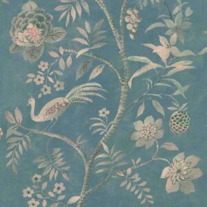
This Graffito wallpaper from the world-renowned Kelly Wearstler captures the perfect balance of funk and sophistication, it comes in a variety of colors including this subdued teal.
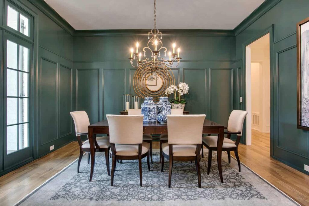
This traditional dining room adds interest to solid colored walls by adding architectural details. The panels going up two-thirds the height of the wall, painting the door casings and other moldings that are typically painted white really wraps the room in color.
Take it Up a Notch With a Mural
I know what you’re thinking! A mural? Bluck! Think again! While decorative painters are highly skilled artisans, you can achieve the same big impact, art-style statement with mural paneled wallcoverings, thanks to digital printing! Large scale complex images and patterns are broken up across several panel widths, then the image is printed directly onto a wide variety of textures and materials that become the wallcoverings. Think less Disney characters on a kid’s bedroom wall, and more like refreshing, contemporary statement walls that are super chic. Like a surprising mural installed in a bathroom, or even a classic chinoiserie-styled wall for a formal dining or living room.
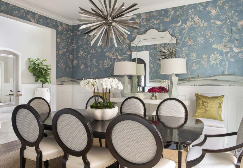
This installation photo shows how this traditionally inspired motif, Shangri-La in Euphoric Teal on Cotton Canvas Linen, can work beautifully with both classic and contemporary elements in a formal setting.
There are many MANY wallcovering design houses I could pay tribute to, but I’ll give a quick shout out to the household name of Phillip Jeffries. They have a wonderful digitally printed mural program, with lots of different styles featured on different grounds and different colorways. Here are a few of my favorites that feature our 2021 color of the year.
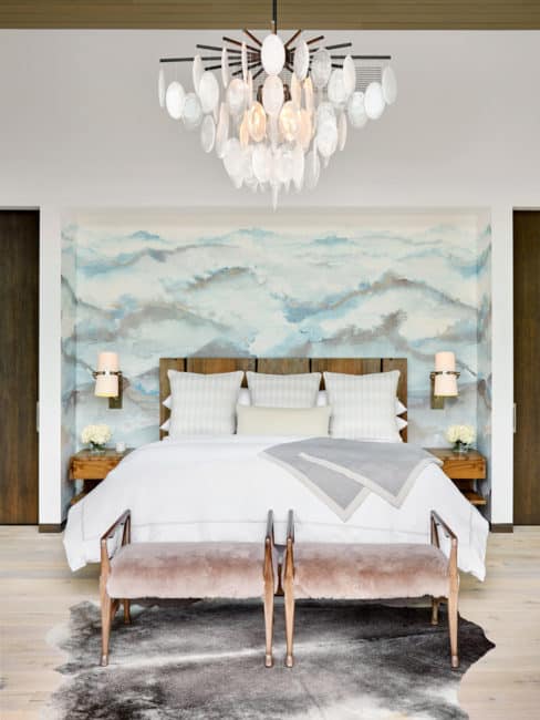
Beyond in Forbidden Teal on Vinyl Glam Grass is pictured in the bedroom and offers an excellent idea for a statement wall behind the bed.
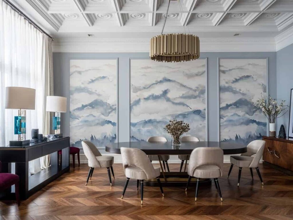
Colorway Heaven on Marshmallow Manilla Hemp is featured in the dining room image. Instead of covering the entire walls, panels have been framed in wood paneling, so instead of traditional framed art hung on the wall, it becomes a more permanent architectural feature.
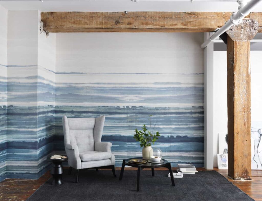
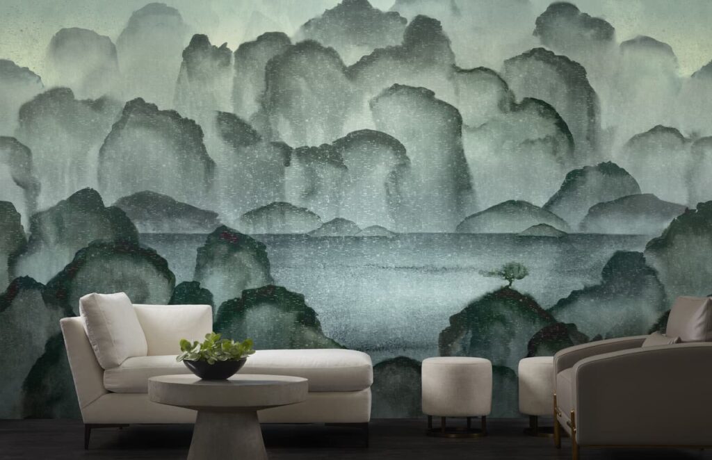
Fade in Seaspray on White Manilla Hemp gives an abstract contemporary feel. I love the way it’s combined with the raw industrial building elements in this install photo.
Mist in Seaspray is printed on Moon Glow Enchanted Woods ground, which is actually a cork substrate with metallic flecks! It gives a full atmospheric experience in a way that paint or wall art simply cannot.
Color in the Kitchen!
We are still seeing a continuing trend of color being used in the kitchen through cabinetry paint colors and fun tile. While the colors have changed and gotten a bit bolder over time, I think the standard all white kitchen is shifting to something a bit more colorful, and that trend is here to stay for a bit!
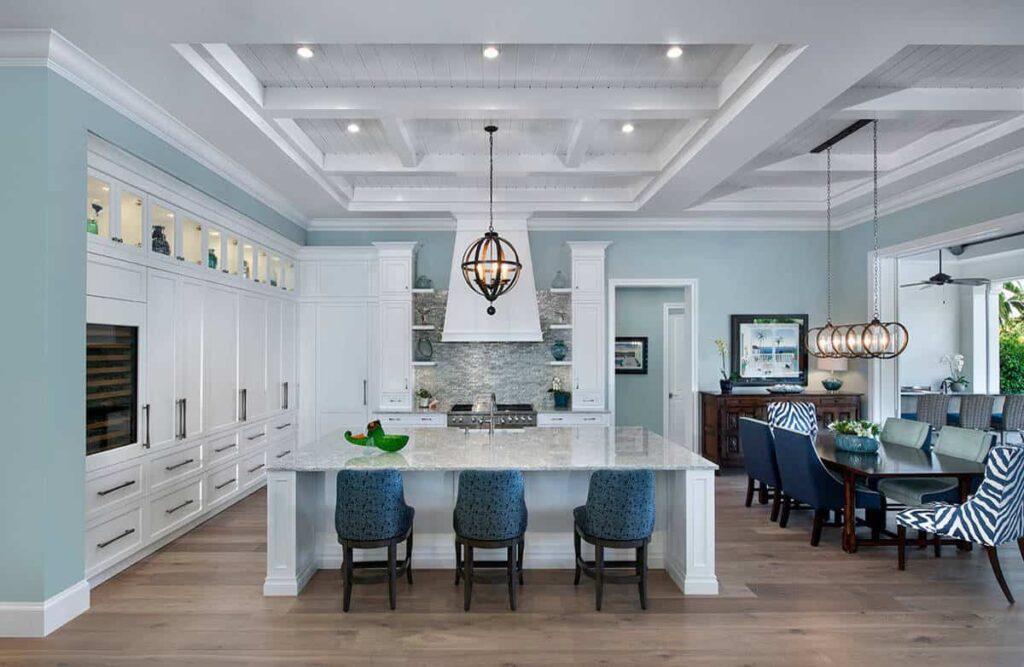
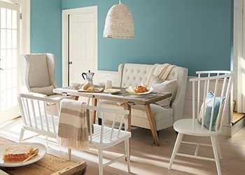
Still too scared of color? That’s ok! I have plenty of clients that are afraid to take the leap and make bold “scary” choices with their paint color. This all white kitchen gets an infusion of color on the walls. I enjoy how there is a variety of tones from the white cabinets, teal walls, and darker blue upholstery, as well as the dark brown wooden furniture. The room feels well rounded without being too bold.
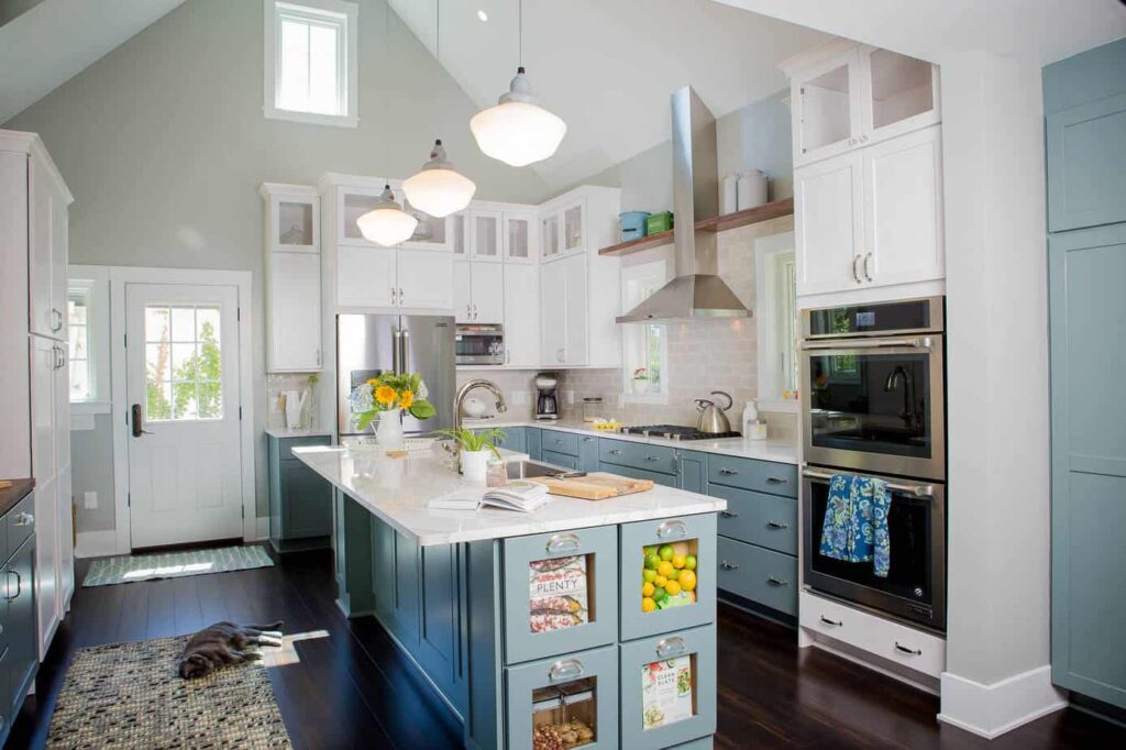
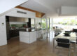
This more transitional kitchen has a fun pop of color. The soft teal reminds me almost of Tiffany’s blue. It’s subtle but adds interest, the island, base cabinets and even a full height pantry are all painted teal. I really like the versatility we see in this teal color, it looked exquisite with lighter wood tones, but equally as nice with more medium and chocolate tones.
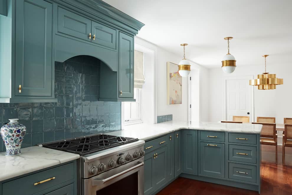
This kitchen is both chic and classic. The cabinets are painted in a high gloss lacquer finish, and the teal blends perfectly with the hand crafted ceramic backsplash tile under the hood. It looks absolutely gorgeous with the white marble, and the more contemporary brass light fixtures add a nice kick against the otherwise white walls.
Take Teal to Your Tile and Bathroom!
Aegean Teal lends itself perfectly for bathroom applications. It’s calm, subdued and reminiscent of the Greek Isles – hello spa oasis! Here are a few beautiful bathrooms incorporating this gorgeous color.
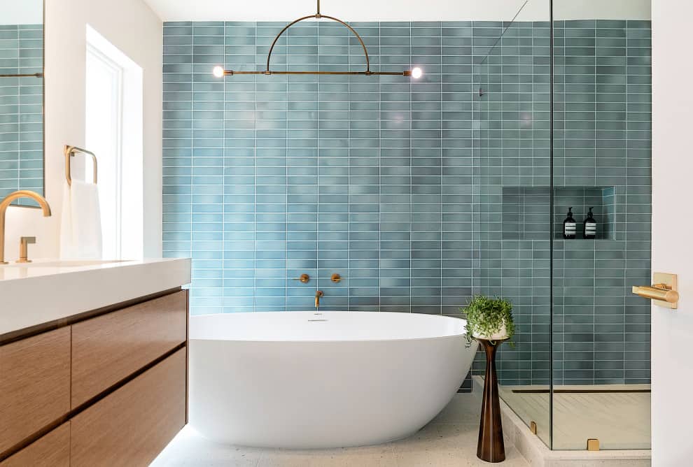
This contemporary bathroom features a brick style ceramic tile in a stacked pattern for clean lines. The movement of the tones of color definitely take a front seat here. Once again the color is complemented beautifully with warm brass and wood tones. (Blue and orange are complementary on the color wheel – meaning they amplify each other!)
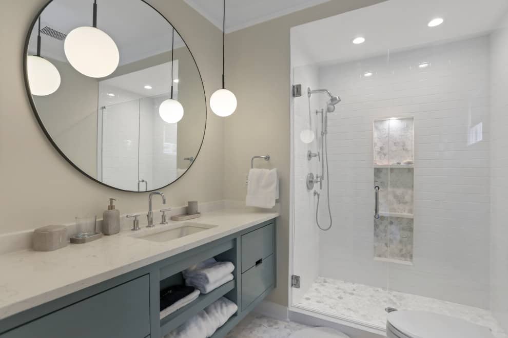
Here we see another contemporary bathroom, but in a much more subtle color palette. This palette is more monochromatic with nickel finishes, white marble, and a softly painted teal vanity. Overall the nickel and teal fall in line with one another giving a more serene feeling.
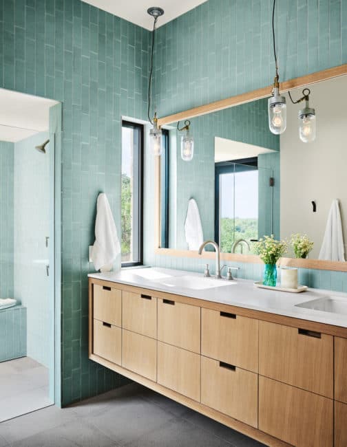
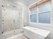
And yet another contemporary bathroom with this beautiful teal color. The tile is run in a broken joint pattern vertically, which is a nice change up of the standard subway brick pattern. The oak vanity and mirror again complement the blue so gorgeously. Making this cool color feel more warm and inviting.
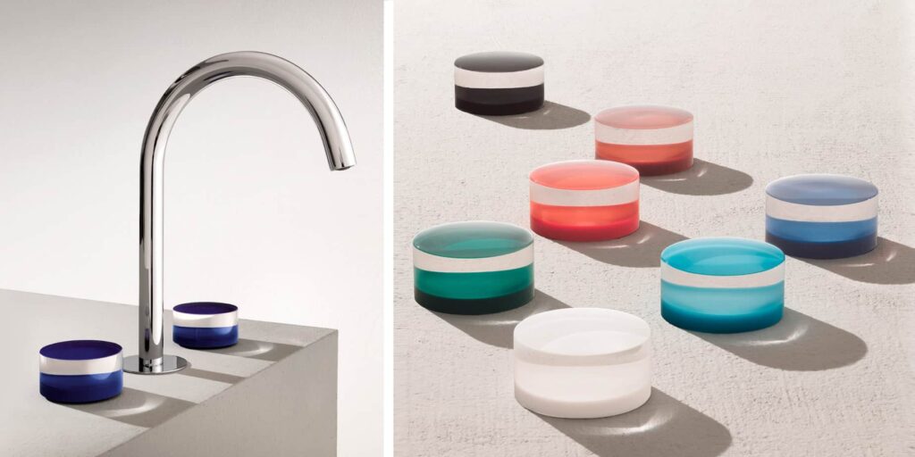
A fun way to add color to your bathroom besides paint or tile is to get creative with your fixtures! I am absolutely obsessed with Fantini’s high style bathroom fixtures that add color but are still super chic. The Nice collection features colorful acrylic handles that come in a variety of styles, they have a beautiful teal color that’s not too bold if you’re afraid of big risks! These pieces are like jewelry for your bathroom.
Add Character to Your Architecture
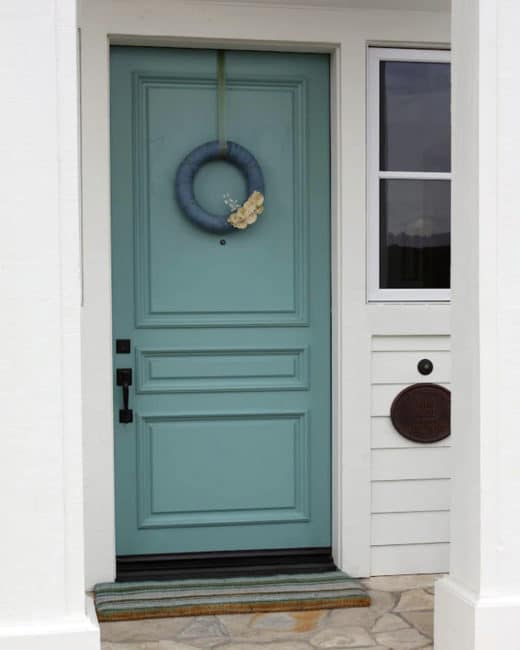
A fun way to make your mark on your home and add a little personality is to take a color you like and add it to an architectural feature in your home. Think of it as leaving your signature on your home. Painting the backs of built-in shelves, the front door, maybe all of your interior doors, or even your mailbox!
I always love the look of a fun colored front door! As long as it coordinates with the rest of the exterior of course. Teal can go bold, but also have more gray tones, making it a great color for white or gray houses.
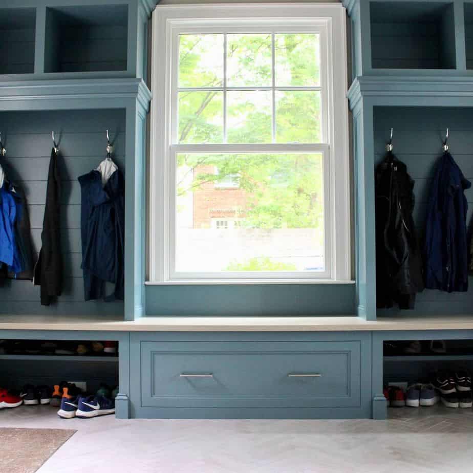
This mudroom design by Jem Woodworking features lovely cabinetry and shiplap in this soft teal color. It adds atmosphere and character to an otherwise utilitarian space. Might I add that clutter and mud will stand out more against a room of all white cabinets compared to a darker color that will wrap the space.
Loving the Color But Feeling Lost?
If you’re not sure how to add color to your space – just ask for help! An interior designer and contractor can help you bring more color and style to your space without feeling like you’ve botched it. If you’re lacking the vision, we’re here for you! From quick changes like paint color or wallcovering, to a full reimagining of your space, we can tackle it! For a free consultation, call a HomeSquare Professional at 914-670-8100 or contact Homesquare today.

Katie Canfield is the founder and principal designer at Studio KC. Studio KC got its humble start in 2015 when Katie was just 23 years old. While she was freelancing with other interior designers in the NY and CT area she also became a go-to designer for local contractors and trades that needed a designer’s help for their clients whether it be for custom cabinetry drawings or plans for a gut renovation on an entire home.
Katie Canfield’s design aesthetic is eclectic and flexible. She delights in the marriage between old and new- keeping spaces approachable but still matching each client’s unique aesthetic and family narrative. Her passion for design keeps her motivated and constantly on the hunt for new trends and materials. Her broad experience includes an art history background, study at the Accademia Italiana in Florence, a stint with the renowned Manhattan firm Amanda Nisbet Design, as well as collaborations with builders and designers across the tri-state area. She’s seen it all: from gutting prewar Manhattan apartments to new construction in the ‘burbs.